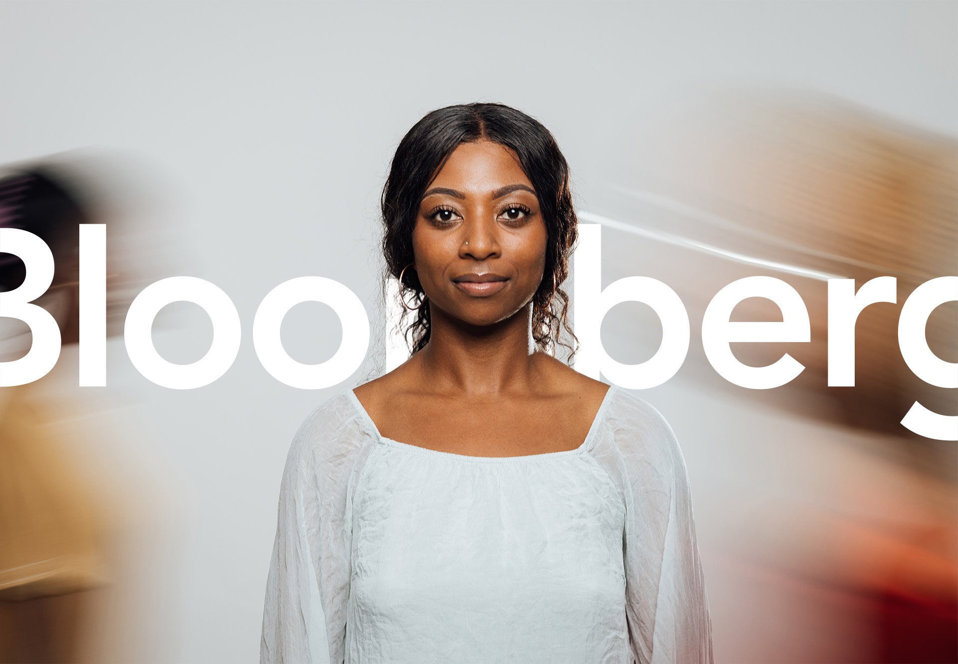
Bloomberg Enterprise
As part of a small, dedicated team, I helped innovate the Crescent design system for Bloomberg’s suite of enterprise digital products. As a creative consultant based in L.A., working closely with their New York and London offices, I focused on unifying and elevating the visual design across their suite of web applications. Our team strived to push the boundaries of Bloomberg’s digital landscape, enhancing both user engagement and efficiency.


Creative Leadership
As a creative consultant for Bloomberg, I managed the creative direction of their web-based design system, supported clients with visual-design needs across their enterprise products, and executed high-level vision work to shape the future of Bloomberg’s products.
Between day-to-day design tasks, and a number of north-star projects aligning web, mobile, and terminal visual-design languages, I continually sought to improve consistency. My goal was to maintain visual clarity, as well as elevate the Bloomberg brand through strategic design decisions. Even the simplest design enhancements had the power to boost efficiency, proving that well-executed visual details can save crucial seconds — ultimately reducing costs and driving performance.
Bloomberg's Design Language
I played a pivotal role in the development and enhancement of Crescent, the company’s enterprise design system. My objective was to inject more of Bloomberg’s distinctive brand personality into its digital products, ensuring a cohesive and engaging user experience.
I explored all aspects of the design system, including brand expression, vision, style guides, components and patterns. I was also responsible for the library of components and patterns. By understanding the core elements of Bloomberg’s brand, I aimed to reflect these in their visual language. I obsessed over consistency — a cornerstone in any effective design system.
Bloomberg Unicode
Bloomberg Unicode – Bloomberg’s unique, proprietary font – is strategically deployed to enhance visual hierarchy and add a touch of distinction to key elements across Bloomberg’s digital ecosystem.
Designed specifically for Bloomberg, Bloomberg Unicode is used across headlines, subheads, dashboards, and annotations. Its bold and assertive character commands attention, guiding users through complex financial data and insights with clarity and confidence. Whether it's punctuating headlines or highlighting critical information across mobile apps, Bloomberg Unicode reinforces Bloomberg’s brand identity with purpose to deliver exceptional user experiences.
Avenir Next
Avenir, Bloomberg’s primary font, has been customised for versatility and clarity, serving as the cornerstone of Bloomberg's visual identity across all digital platforms.
Avenir is used for conveying information with precision and sophistication, ensuring a seamless reading experience for Bloomberg’s global audience. From web apps to headlines, subheads, and body copy, Avenir maintains consistency and legibility. It embodies the essence of Bloomberg's brand ethos: forward-thinking, insightful, and universally accessible.


Shaping the Future of Design
Crescent’s elevated brand alignment provided an improved user experience across all its digital products. The design language benefited users and streamlined processes for internal teams and enterprise partners, leading to greater productivity.
Collaboration was at the heart of this success. Working with such a talented and dedicated team was a deeply rewarding experience. The positive team environment fostered creativity and mutual support, enabling us to achieve our goals collectively. I’m proud of the contributions we made together and the lasting impact our work had on Bloomberg’s digital presence.


